A lot of people panic over website design.
They spend way too much time and money on fancy logos and silly little flourishes that don’t make a difference to their bottom line. I’m VERY guilty of this.
The thing is, ultimately, your customers are looking for good advice, useful information and products that will make their lives better.
Your design is purely there to make your content shine. It should allow for easy and pleasurable website navigation so they can get what they need faster.
BUT…
There are dangers in getting your design wrong. A few common design howlers can:
• Annoy new visitors and push them to other sites
• Fail to show your content in the best light
• Undermine your credibility
• Contradict your brand or send the wrong message
Here are 12 website design mistakes that you should check for.
1. A ‘click here to enter’ page
A lot of websites still have a front page with text that says: “click here to enter the website”.
This means visitors have to click through to access the articles, images, links, ‘about me’ page and other essentials.
Why make visitors work harder?
Your front page should be your home page, filled with your best, most engaging and relevant content. At a glance the visitor should be able to understand exactly what your website is about.
2. No search box
People use search boxes on websites less and less these days, but that doesn’t mean you shouldn’t give people the option.
Almost all the WordPress themes let you put in a search box where the visitor can put in the word, product or name they are looking for.
It’s a vital shortcut for busy people who want information quickly. Yes, you want them to navigate and browse your site, but there will be many who have a very specific thing they are interested in. Give them the opportunity to go directly to it before they leave in a huff.
3. Poor colour contrast
This is a classic design mistake. You find a great looking website, but the text is in a faint brown or grey which fades into the colour behind it.
Keep the contrast high so that the text really sticks out on the page. Again, don’t make it hard for people to quickly and easily scan your page. They should immediately be able to tell what it is that you’re writing about.
Here’s an example:
Can you see what I mean? It’s like trying to see through a mist!
4. The wrong font
A serif font is one of those, like Times New Roman, where the letters have little tails trailing from the bottoms and tops of the letters.
It looks good on paper… but not so good on a website.
Sans-serif fonts (including Helvetica, Arial, Futura and Franklin Gothic) are far easier to read online.
Here’s a sans-serif used on the BBC News website, for example:

Also try to avoid mixing up serif fonts, italics, comic sans and other quirky typefaces, as it will start to look cluttered and disjointed.
5. Hard-to-read copy
People are on your website because they want to read your content, but they probably don’t have a lot of time.
So make sure it’s instantly easy to read and digest.
• No long blocks of text that look difficult and unfriendly: break them into small paragraphs and vary the size of those paragraphs.
• Use sub-headlines to flag up sections of the text easily so that the eye can scan down and pick up the essential information.
• Make sure there is white space on either side of the text and that the text is in a relatively narrow column, rather than spread out across the page. Again, see the BBC’s website above for a good example.
Here’s an example of a post claiming to be about ‘website design mistakes’ that actually makes this error:
6. Your Images are too large
When you put photos on your website, make sure their file size is not too large, otherwise they will slow down your website. You don’t want people to have to wait while your page loads up. This will cause them frustration and – usually – force them to go elsewhere for what they want.
If you have Photoshop, then you can easily lower the size of a picture there. Or try one of the resizing tools online, for instance http://www.picresize.com/ or http://www.shrinkpictures.com/.
If you’re using a WordPress website you can let this plugin automatically shrink images to the correct size for you: https://premium.wpmudev.org/project/wp-smush-pro/.
7. Reversed out text
Avoid white-on-black text like this:
While it’s fine for menu bars or very small sections (for example, ads or banners), it’s too hard to read when it’s the main copy.
8. Too much content on one page
Don’t try to cram too many different ideas, images, videos and offers on one page. Your homepage should set out what you do and how you can help people (and will probably be your busiest looking page), but on the whole you want each page to guide people to one action.
With that in mind, each page should do something particular. For instance, a page for a blog post, a page for ‘about me’, a page for sales copy, a page for contact details. Don’t try to do everything at once as it will confuse your reader.
9. Using inappropriate images
One sure sing of a dodgy or amateurish website is one that has images that don’t really support your business brand or identity – or that don’t suit your prospects’ taste.
For instance, scantily clad women, or pictures of wads of cash, flashy cars and other images could ring alarm bells for people, even if your content is good.
Same goes for cheap clip art, bland or meaningless stock photos or poor quality self-taken photos.
10. Poor navigation
Your visitors should be able to move through the website pages quickly and easily to find what they want.
Make sure there is a menu bar, categories, shortcuts and links – but that it looks NOTHING like this:
11. Poor choice of colour
It’s important that the colours on your website:
• match the tone of your content;
• tap into the mood of your visitor;
• and give out the right emotions and signals for your subject matter.
Don’t be totally crazy, like this website:
Creativebloq have posted a helpful guide here: http://www.creativebloq.com/web-design/12-colours-and-emotions-they-evoke-61515112.
12. Following the rules
Ha, now I am going to totally undermine everything I’ve just written…
But sometimes the biggest mistake is to be boring and do what’s expected, or look the same as everyone else.
Ultimately, you want your business to stand out against your competitors.
So occasionally, design rules can be broken.
As an extreme example, let me show you a website that commits ALL of the design howlers I’ve just told you about.
Yet Newsweek has described it as “one of the best websites ever made”. Ling told the magazine that she released $106,192,200 worth of new cars in the UK in 2015.
It’s for a tiny UK car-leasing company called Lings Cars.
This is her homepage.
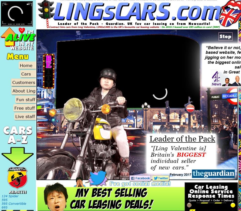
Amazing isn’t it?
Check out the link for the full head-mashing experience: https://www.lingscars.com/.
Now I’m not saying you should copy this – but it should remind you that in a cluttered online marketplace, you can get a lot of attention by being different.
However, you can only start breaking rules when you know the rules in the first place!
I believe you missed one of my pet peeves. Writers/Publishers think the internet is like a printed newsletter. They put two columns of text per page. This usually occurs in PDFs. This may be fine if you have a vertical display but I don’t and many times I am using a laptop. Scrolling down the first column and then having to find the top of the second column to read is a pain in the neck.
I’m with you on that one Dan, that is very annoying.
Your content was appropriate as it would not expand on my iPad, it was not so easy to read. Why don’t you practise what you preach?
Hi Robert, thanks for your comment. Can you elaborate a little? I’m just testing it on my iPad now and can’t seem to recreate the same issue. When you say expand do you mean you can’t zoom in, the content is too narrow, or the font is too small?